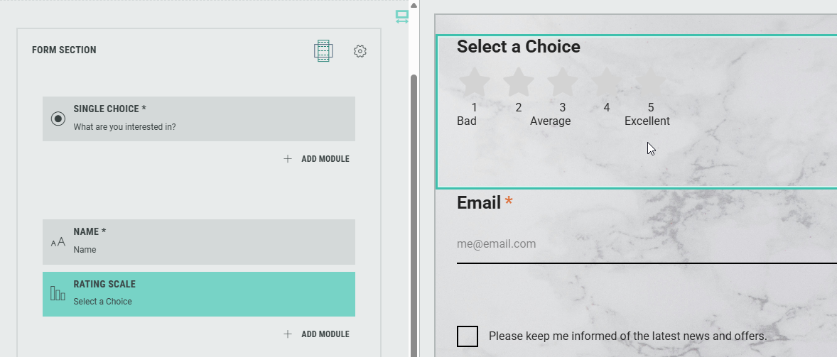
Rating Scale Module
The Rating Scale module can be added and used within a Form Section to let participants rate the Experience or share their opinion using a defined scale.
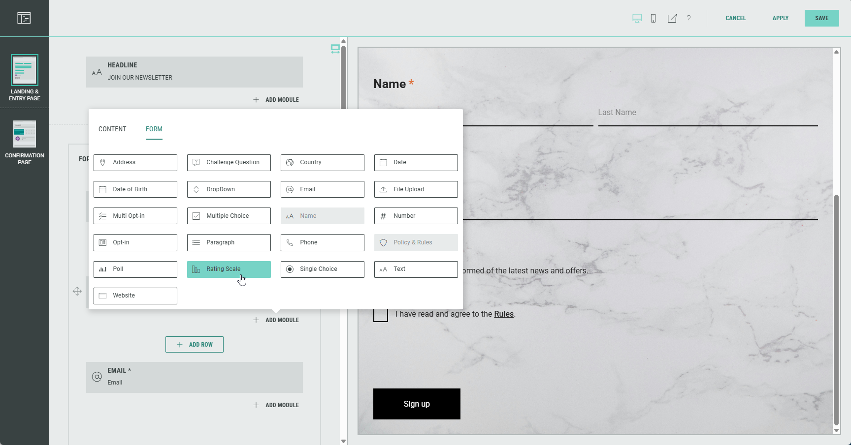
Edit the Rating Scale module in the Page Builder by clicking on the Pencil icon.
The following sections are available which can be edited (from the tabs at the top): Settings, Design, Logic.
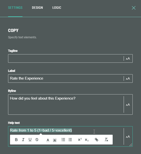
Settings
On the Settings tab, you can configure:
- Copy — Specify text content and apply styling for tagline, label, byline and help text.
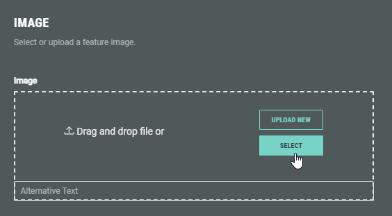
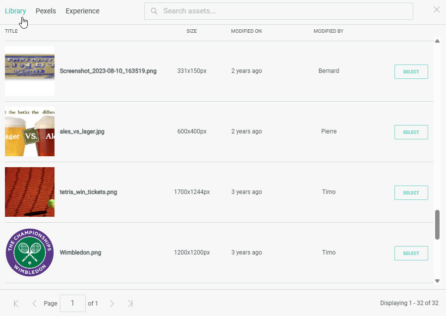
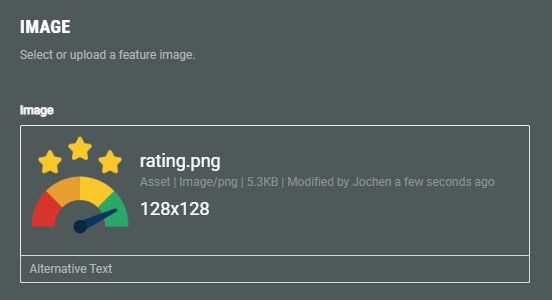
- Image — You can accompany the label with an image by uploading one from your computer, or selecting from pre-uploaded assets from the Grow library or the Experience, or from the Pexels library.
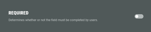
- Required — Enable the toggle to make this a required field for the Experience participant to complete.
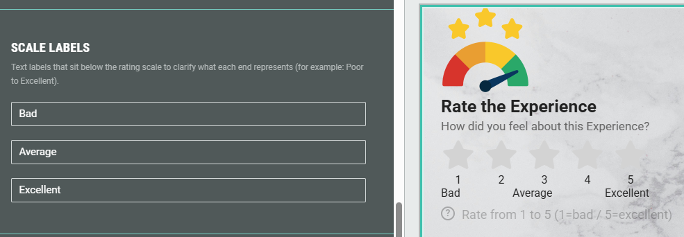
- Scale labels — You can add up to three labels beneath the rating scale to help users understand what the beginning, middle, and end values represent. (for example: Poor—Average—Excellent).
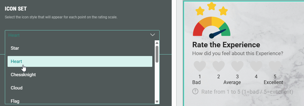
- Icon set — When the icon based rating scale is selected as design, you can pick an icon style from the drop-down to define how the rating scale values are displayed.
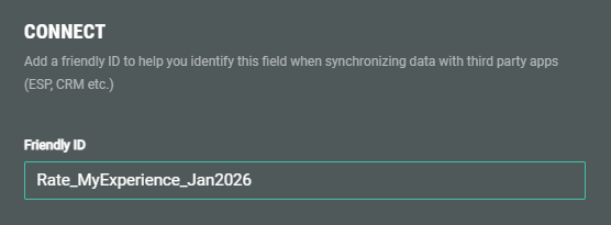
- Connect — You can add a Friendly ID to help you identify this field when synchronizing data with third party apps (ESP, CRM etc.)
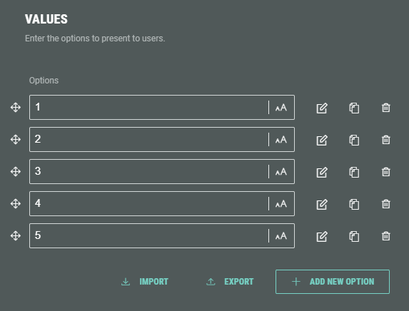
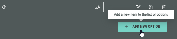
You can add new answers by clicking on the + Add New Option button.
The options can be ordered the way you want by holding down the mouse cursor onto one of the 4-directional arrow icons, and dragging and dropping the option up/down to the desired location.
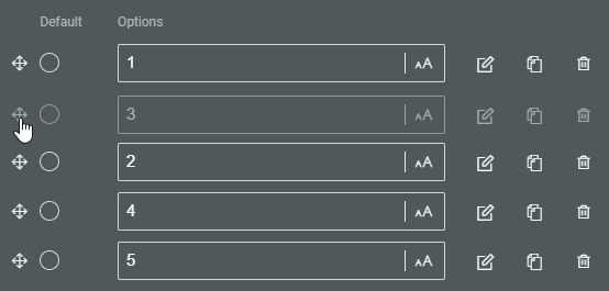
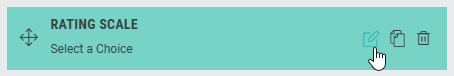
Each option shows the following clickable icons on the right:
 Edit choice — To edit the option.
 Clone choice — To duplicate the option, with identical label, data and image.
 Remove choice — To delete the option.
Edit choice
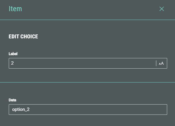
The Edit choice screen shows the following options:
- Label — The option label. This field gets auto-populated after adding an option label in the Values section on the main screen. If desired, you can change it here.
- Data — The data value is used to help you identify this field when synchronizing data with third party apps (ESP, CRM etc.)
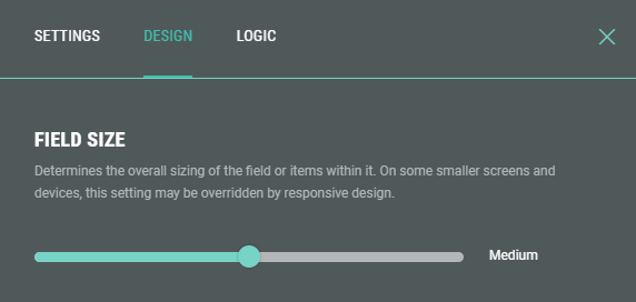
Design
- On the Design tab, select a tile style.
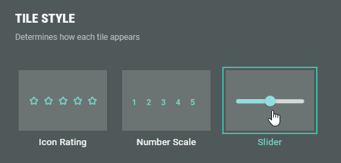
- Icon Rating — The icons are displayed in the style defined on the Settings tab.
- Number Scale — The actual option values are displayed as configured on the Settings tab.
- Slider — The ratings are shown on a draggable/clickable slider.
- When Slider is selected as style, an additional section is displayed to set the field size by dragging the slider to the left or right (check the preview window on the right to verify the desired field size).
- Additionally, you can assign a CSS classname to the module for using custom CSS styling.
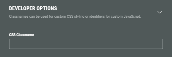
Warning: Using a custom CSS classname will overwrite the default styling.
Only use this when you're familiar with using CSS code.
Logic
On the Logic tab, you can determine if the Rating Scale should only be shown to participants when some conditional logic is met.
Note: More info on branching logic can be found in this article.